Have you ever visited a blog and felt instantly drawn in by its look and feel? A great blog design can make reading more enjoyable, keep visitors on the page longer, and encourage them to explore more content.
In this article, I’ll take you on a tour of some of the most beautifully designed blogs out there. These examples showcase creative layouts, stunning visuals, and user-friendly features that make them stand out. As a beginner, these examples can inspire you to take your blog to the next level.
Best Blog Pages
1. A Beautiful Mess:
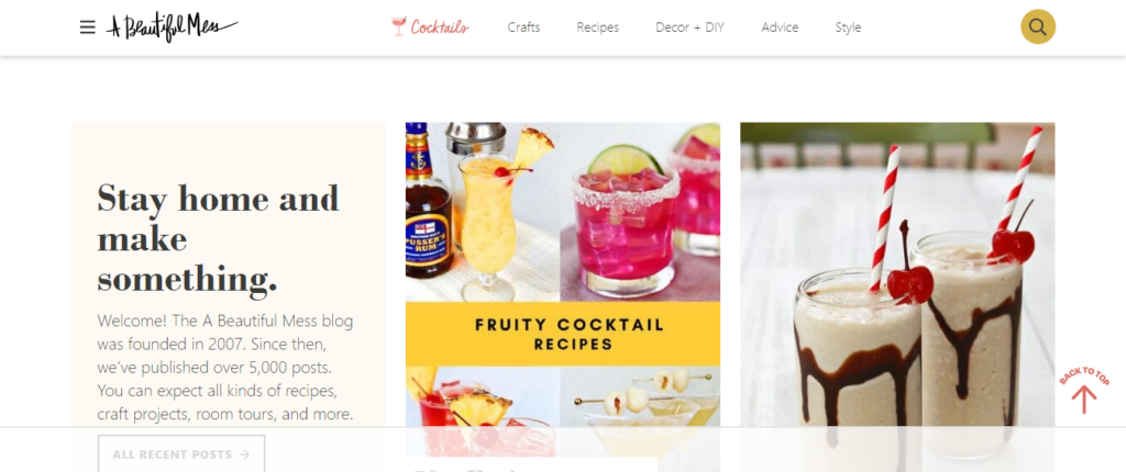
A Beautiful Mess is a lifestyle blog created by sisters Elsie Larson and Emma Chapman. This blog stands out because of its colorful, fun, and inviting design. The pages are filled with vibrant photos, easy-to-read fonts, and well-organized sections. Whether it’s recipes, crafts, or home décor, each post is visually appealing and easy to navigate. The consistent use of bright colors and clean layouts makes the user experience enjoyable and keeps readers coming back.
2. Smashing Magazine:
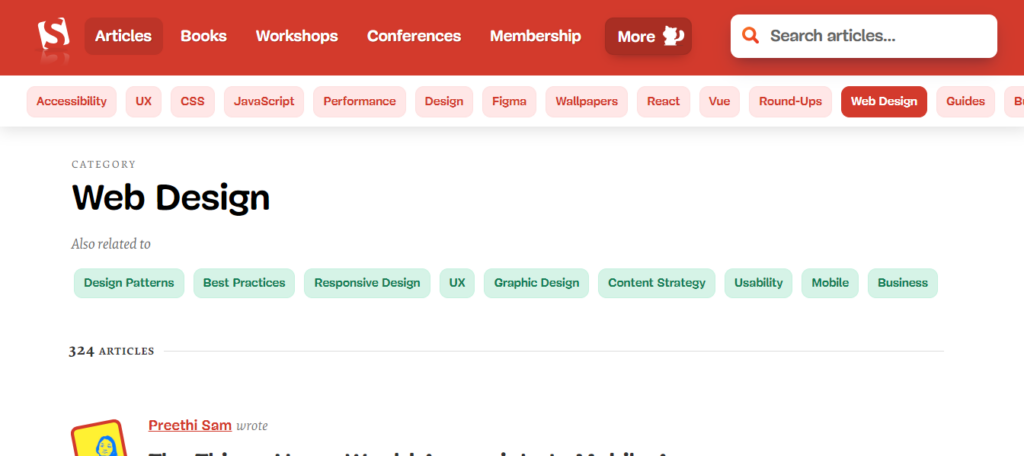
Smashing Magazine is a go-to resource for web designers and developers. Its design is sleek and professional, reflecting the quality of its content. The use of a well-structured grid layout helps in presenting a large amount of information in an organized manner. Each article is easy to read, with ample spacing and clear headings. The site also uses contrasting colors to highlight important sections, making it easier for readers to find what they’re looking for.
3. Cupcakes and Cashmere:
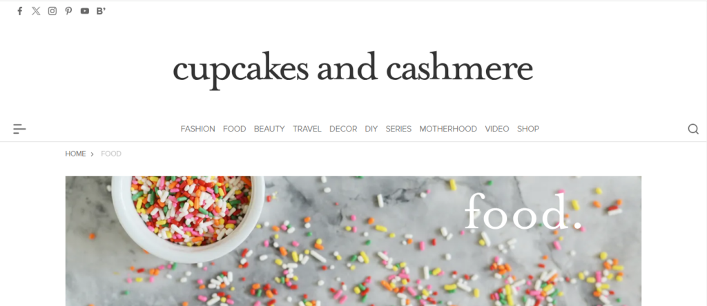
Cupcakes and Cashmere by Emily Schuman combines lifestyle, travel, beauty, and food in a beautifully designed blog. The site uses a soft color palette and elegant typography, making it visually appealing. High-quality photos accompany each post, and the layout is intuitive, allowing readers to easily find related content. The overall aesthetic is chic and sophisticated, reflecting personal style.
4. The Marginalian:
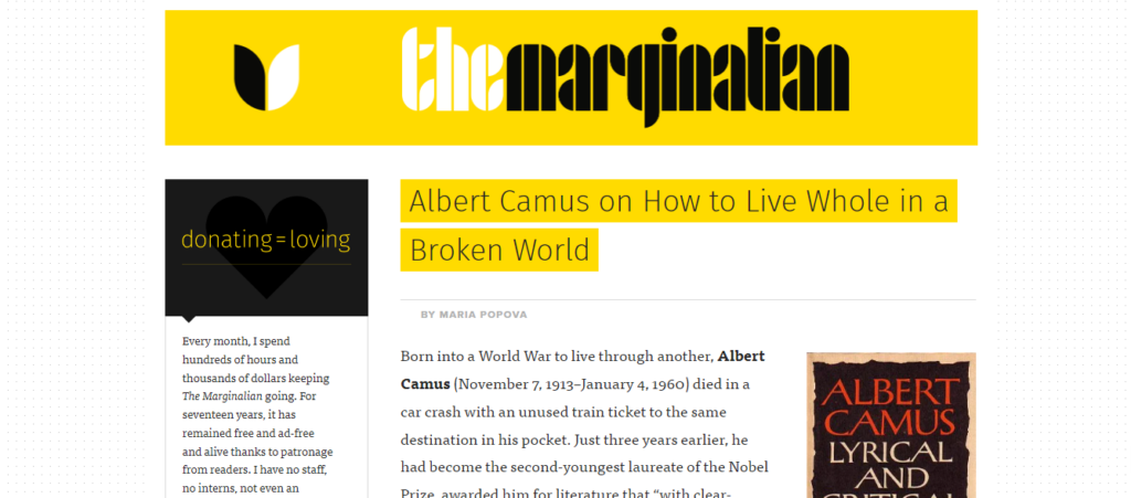
The Marginalian by Maria Popova is a treasure trove of insightful articles on art, science, design, and more. The blog features a simple yet effective design with a focus on readability. The use of a clean, single-column layout ensures that readers are not distracted by sidebars or ads. Elegant typography and thoughtfully placed images enhance the reading experience, making each article a pleasure to read.
5. Wit & Delight:

Kate Arends’ blog, Wit & Delight, offers a mix of lifestyle, design, and wellness content. The design of the site is modern and stylish, with a cohesive color scheme and clean lines. The homepage features large, high-quality images that draw readers in, and the content is well-organized into easily accessible categories. The blog’s design is both functional and visually pleasing, making it a joy to browse.
6. Nomadic Matt:
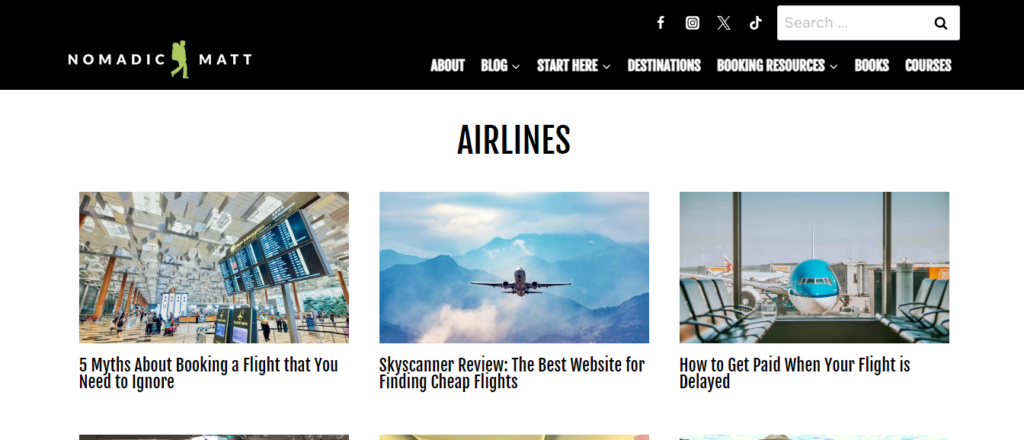
Travel blogger Matt Kepnes runs Nomadic Matt, a blog dedicated to helping people travel better and cheaper. The blog’s design is user-friendly, with a focus on accessibility. The homepage features a clean layout with prominent links to key sections like travel guides, tips, and blog posts. The use of bright, travel-themed images and clear, concise text makes it easy for readers to find useful information and get inspired for their next trip.
7. Pinch of Yum:
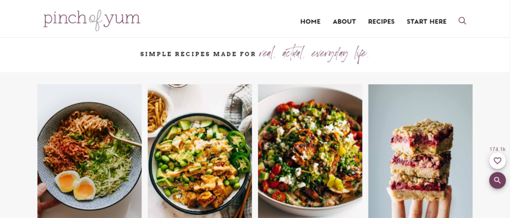
Pinch of Yum is a food blog by Lindsay Ostrom that showcases delicious recipes. The blog’s design is appetizing, with mouth-watering photos and a clean, easy-to-navigate layout. Recipes are well-organized and easy to follow, with step-by-step instructions and clear headings. The use of vibrant colors and professional-quality images makes each recipe visually appealing, encouraging readers to try them out.
8. Zen Habits:
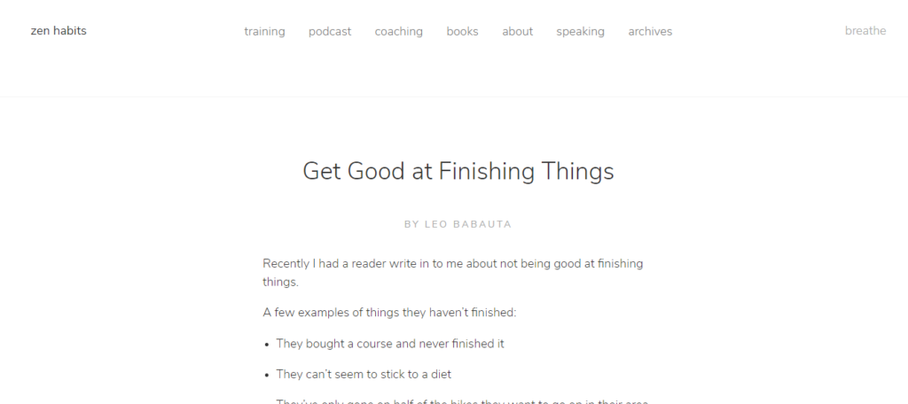
Zen Habits by Leo Babauta focuses on simplicity and mindfulness. The blog’s design mirrors its content with a very minimalist approach. There are no distractions, just plain text and a few images. This simplicity helps readers focus on the valuable insights and advice Leo shares.
Blog Pages Layout Tips
1. Whitespace in Blog Design:
White space, often called negative space, is the empty area around text and images on a blog page. It might seem like wasted space, but it actually helps make your content easier to read and look more inviting.
This allows the eyes to rest and helps organize the information so readers don’t feel overwhelmed by too much clutter. By using white space wisely, you can highlight important parts of your blog and make the whole page look cleaner and more professional.
2. Choosing the Right Color Scheme:
Selecting a suitable color scheme for a blog page design is a critical step that impacts user experience and engagement. A well-chosen color palette can establish the blog’s tone, convey its personality, and enhance readability, ultimately making content more inviting and accessible.
Begin by understanding the target audience and the emotional responses that different colors evoke; for instance, blue often conveys trust and professionalism, while green can suggest tranquility and growth.
3. Selecting the Best Font:
Choosing the right font for your blog is important because it affects how easy it is for people to read and enjoy your content. Start by picking a font that is clear and simple, like Arial or Times New Roman, because these are easy on the eyes. Make sure the size is big enough to read on both computers and phones.
Also, think about your blog’s theme; a fun, playful font might be great for a kids’ blog, while a clean, professional font works well for business topics. Don’t use too many different fonts; sticking to one or two makes your blog look neat and organized.
4. Including Visuals:
Using visuals on your blog pages can make your content more engaging and easier to understand. Pictures, infographics, and videos break up long blocks of text, making the page more inviting to readers.
They can illustrate key points, add interest, and help convey complex ideas more simply. Good visuals also make your blog look more professional and can help capture the reader’s attention quickly.
5. Improving Navigation for a Better User Experience:
Improving navigation on a blog page means making it easier for visitors to find what they’re looking for. Start by organizing your content into clear categories and using simple, easy-to-read menus at the top of the page.
Adding a search bar helps users quickly locate specific topics or posts. Using internal links within your blog posts can guide readers to related content, keeping them on your site longer. Make sure your design is mobile-friendly so it works well on phones and tablets.
6. Using Call-To-Actions:
Using call-to-action (CTA) buttons on a blog page is like giving your readers a friendly nudge towards doing something specific, like subscribing to your newsletter, downloading a guide, or leaving a comment.
These buttons are usually bright and noticeable, with clear words like Sign Up Now or Learn More that tell people exactly what to do next. Having CTAs can make your blog more interactive and engaging, helping you build a stronger connection with your audience and achieve your goals, whether growing your email list or increasing reader engagement.
7. Loading Speed:
Load speed is how quickly your blog page shows up on someone’s screen after they click on it. It’s essential because people get impatient if a page takes too long to open. If it takes more than a few seconds, visitors might leave before they even see your content.
To load your blog pages faster, you can use smaller image files, remove unnecessary plugins, and choose a good web hosting service. A fast-loading blog not only keeps your readers happy but also helps your site rank higher in search engines like Google.
8. Best SEO Practices:
Designing blog pages with SEO (Search Engine Optimization) in mind helps your content get noticed by more people. To do this, start with a clear and simple layout that’s easy to navigate. Use relevant keywords in your titles, headings, and throughout the content to help search engines understand what your post is about.
Use descriptive, keyword-rich alt text for images, and include internal links to other relevant posts on your blog. Also, write engaging meta descriptions that give a quick summary of your post to entice people to click on it. This combination of good design and SEO practices can help your blog rank higher in search results.
Conclusion
In conclusion, designing an engaging and user-friendly blog page doesn’t have to be complicated. By looking at these examples, you can find inspiration for layouts, color schemes, and fonts that best fit your content and audience. A good page design is not just about aesthetics; it’s also about usability and creating an engaging environment for the reader.
Related Questions
Q: What is a blog page?
A blog page is a website section where regularly updated content, known as blog posts, is published. These posts can cover a wide range of topics and are typically displayed in reverse chronological order, with the most recent posts appearing first.
Q: How many pages are in a blog?
The number of pages in a blog can vary widely depending on the content and structure. A blog can have just a single page or hundreds of pages. Commonly, blogs have multiple pages, including the main blog page, individual post pages, category pages, and other informational pages like About, Contact, and more.
Q: How can I create a blog page?
To create a blog page, follow these steps:
- Choose a platform (e.g., WordPress, Blogger, Medium).
- Sign up and set up your account.
- Select a blog template or theme.
- Customize your blog’s design and layout.
- Create and publish your first post.
- Promote your blog via social media and other channels.
- 130+ Psychology Blog Names - March 29, 2025
- Side Hustle Ideas: 10 Sites To Get Paid To Answer Questions - March 25, 2025
- 100+ Language School Names - March 22, 2025

